
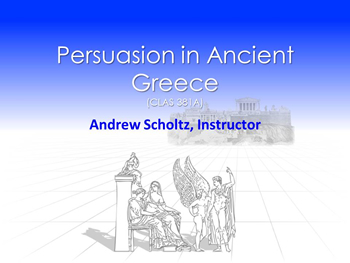
Persuasion in Ancient Greece
Andrew Scholtz, Instructor
Informational Pages. . .
PowerPoint Help
- This isn't a technical how-to for the PowerPoint program. Rather, it's mostly a best-practices guide, with technical help as needed (for instance, for inserting text into the "notes" area of a ppt). I'll try to make my own presentations exemplary of what I mean. But also use the following as guides:
- My specially designed sample PowerPoint
- Designing an Effective PowerPoint Presentation @ Owl
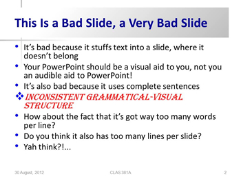
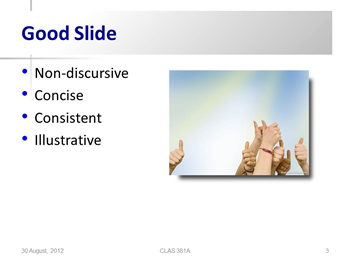
- "PowerPoint Presentations: The Good, the Bad and the Ugly"— please take note of that word "ugly"
Introduction
The slides of a PowerPoint presentation shouldn't deliver content. Like a visually attractive but seriously minimalist outline, the PowerPoint merely structures and illustrates content more or less unobtrusively. It provides cues for topics and transitions, it supplies verbal examples (quotes) and visual examples (images) where needed. BUT IT SHOULDN'T BE TELLING THE STORY ON ITS OWN.
PowerPoint can, and often does, kill presentations through poor use and overuse. That includes filling the screen with your text, excessive complexity, poor design. LESS REALLY IS MORE!
In what follows, I supply pointers for how to create effective slides and how to make then part of an effective oral presentation.
Presenting with PowerPoint
In this section, just a few tips not for creating PowerPoint slides, but for using them effectively in oral presentations:
- Don't let your PowerPoint, the script you're holding in your hands, etc. come between you and your audience:
- Don't hide your face behind your script. Look up, make eye contact.
- Don't speak to (face) the screen — don't, in other words, turn your back on the audience. Speak to them.
- Use the mouse as your pointer. With a screen in front of you and a script in your hand, you shouldn't have to turn to the screen.
- Always foster that connection with your audience!
Design, Content Issues
Unless you're a PowerPoint pro, IT IS HIGHLY RECOMMENDED THAT YOU USE VERY SIMPLE (non-distractive!) BUILT-IN THEMES. Exploit the default bulleted outline to maintain consistency and structure. If not using built-in design themes, keep it simple. Use big fonts (44-point headings, 32-point text). Avoid crazy colors, overdone transitions, all noises.
General
 Try to avoid using low-resolution graphics. Often blurry/bleedy-looking, they're not attractive. If you're going to do a Google image search, search only for "large" images. If you don't have good image editing software or know-how, ask yourself if it's really worth it to slap something into your ppt that just doesn't work.
Another potential pitfall is Google-searching an image under a search term that seems right and then getting something all wrong — the wrong Socrates, say. (It was a common name.) Don't use images carelessly. The University offers access to ARTstor, which provides explanatory notes to help you assess the suitability of an image.
Title Slides
Choose "Title Slide" from the Layout menu panel. It can be ornamental, but must contain minimal information. It's just a title:
Content Slides
It is vital that these not function as your script! Your text will reside elsewhere; for your Gorgias PowerPoint-essay, it'll go into the "notes" area (see below). That's because content slides shouldn't convey content; they should supply topic cues and the like, your talking points ("power points") in pithy, outline form structuring content visually.
- The other use of "content" slides is to take the place of a handout, that is, for pictures, graphs, maybe a quote — something you need or very much want to flash on the screen.
Rules of thumb:
- Include a title heading for most slides (space supplied by default in edit mode)
- Try to use the bulleted outlining feature, the default for "content slides"
- Avoid the use of periods at the end of bulleted lines
- Keep your content slides simple and uniform
- DON'T TYPE SPACES BETWEEN BULLETS!
- That's an inelegant way to fix the look of the spacing on your slide. You're much better off picking a decent-looking built-in design and just going with what it gives you, or else using the line-spacing-adjustment tool ("paragraph" menu) to fine-tune that aspect
- Within a single slide, maintain parallelism (grammatical, visual, etc.)
- If using transitions/animations, keep it simple
- If flashing a quote for reference, pare the quote down to its essentials! (And don't read long quotes off the screen!)
- For slide text, use nouns, short noun phrases, adjectives. Avoid:
- Discursive (talky) style, complete sentences, long anything per bullet
- Finite verbs, verb phrases ("Was like a tyrant")
- Generally, no more than four individual "power points" per page
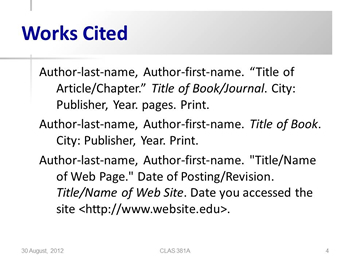
Works Cited Slide
Provocative, Off-Color Material and the Like
PLEASE AVOID the use of gratuitously off-color, provocative or otherwise sensitive material (of a sexual, racial, religious, etc. etc. nature ). Ask yourself, "Is this image / quote / whatever what I'm actually focusing on for my presentation? Or is it there just to get a laugh, even if some may find it distasteful?"
Notes Area (Pane)
For your Gorgias PowerPoint-essay, I'm asking you to locate the text of your essay in the notes area of the PowerPoint presentations you'll be uploading-submitting — that rather than having you create and submit a separate word-processed document.
Why?
Partly for my convenience (to have text and slides all in one place) and partly to get you to think of presentations-plus-visual-aids as a single thing.
(I'm not requiring that you do your group-oral-report script this way, just the Plato Gorgias assignment.)
Entering Text into Notes Pane, "Normal View"
Here follows what it looks like to edit your notes in either "normal view" or "notes page" view. . .
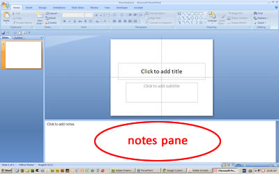
"Normal view" is the view that comes up by default when you start PowerPoint. It divides the edit screen into three panes: a thumbnail/outlining pane on the left, the slide pane (= the main editing pane) on the upper right, and the "notes pane" snuck into the bottom right.
Editing in "Notes Page" mode via "View" Menu
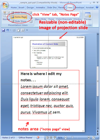
In editing text being entered into the notes area of a ppt, it's also possible to work in "Notes Page" mode. You access the "Notes Page" view via the "View" tab. It does not allow you to edit your projection slide (use "Normal View" for that).
But it's probably easier to enter text into that notes pane, "normal view." If what you enter into the notes text box gets too long, it'll seem to overflow the box. There's nothing wrong with that. Printing the notes works fine; the overflow goes onto an additional page. But it may be easier visually to edit in "Normal View."